Marketing
A large part of my professional experience has been in marketing. I take pride in being able to craft visual designs and implement them across various mediums and platforms. I have a proven track record of increasing sales, customer interactions, lead generation and website traffic through Google Ad campaigns, email marketing initiatives and more.
Below I have included my 6 month report from Daymak Inc. Here you can see the breakdowns of various metrics and see remarkable increases to traffic, sales, and interaction rates.
Key Takeaways
On the website Shopify platform, Online Visitors increased 26% percent compared to the same period the previous year. This increased traffic led to a 47% increase in sales.
This increase in traffic and sales was a result of Google Performance Max campaigns and Email Marketing initiatives. Prior to my tenure at Daymak, the company only used Display Ads for their marketing campaigns. I conducted A/B testing on the Display Ads vs the Performance Max campaigns (PMax) with the PMax campaign receiving only a third of the budget. The latter campaign, out performed the display ads in every category. (Seen on Slide 2 & 3) Despite these findings, it was the company’s decision to still primarily use Display Ads.
In conjunction with the Google Ads, I implemented a social media post calendar to standardize and increase posts for all the associated Daymak companies. This helped to increase our online presence and further boosted interaction rate on social media ads and Meta campaigns.
In order to ensure success and to further increase online visibility and conversions I created a Google Merchant centre to help advertise the products across Google. These were paired with a new comprehensive suite of display ads.
The 6 month marketing report I prepared demonstrated that despite the PMax campaigns receiving only 3.44% of the budget, they were responsible for 15% of the clicks, achieving a CTR (click through rate) of over 5%. Comparatively, the Display Ads received 94.66% of the budget and was responsible for 84% of the clicks, achieving a CTR of less than 0.25%.
Digital Design
On my digital design page, you’ll find some examples of social media campaigns, google ads, UI/UX Designs and email campaigns. I have created a range of digital media campaigns ranging from static media posts, to comprehensive online campaigns that capture the brand identities of the respective companies and encourage lead generation, sales and impressions.


Email Campaign Design & Google Ads
I was tasked with the development of a conceptual email campaign for “KINSHP,” focusing on their upcoming ‘Back to Business’ collection. The objective was to craft an email that not only showcased the new collection but also instilled a sense of urgency, emphasizing that customers had only 24 hours left to pre-order items before their official release.
The requirements and details for the email were as follows:
→ Business casual pieces for everyday wear
→ Colourful statement pieces
→ Suitable for work and play
→ Made with 100% Wool Include
→ Unisex imagery
→ Creative copy to describe the collection
→ Unsubscribe copy at the bottom of the email
To embark on this project, I drew inspiration from successful email campaigns within my own inbox, using them as a foundation to design a layout that showcased the collection’s diverse styles effectively. This approach ensured clarity and captured the audience’s attention, particularly with the strategic placement of a countdown clock at the header of the email.
I then curated a color palette that included shades of sage green, dusty rose, midnight blue, and mustard yellow, serving as a vibrant accent. These choices complemented the imagery and clothing, adhering to a unique, hipster aesthetic without overpowering the collection’s visual appeal.
To highlight the collection’s versatility—suitable for both professional settings and casual outings—I creatively manipulated three images in Photoshop, overlaying them with the words “Work,” “&,” and “Play.” This innovative technique subtly communicated the dual functionality of the attire while allowing the collection to visually stand on its own.
Further embracing the hipster theme, I utilized a combination of serif and sans-serif fonts to draw attention to key information and add visual interest to the email. Multiple calls to action were strategically placed throughout, accompanied by engaging copy that detailed the wool composition of the collection and provided contact information for the company.
This project was an enriching experience that showcased my ability to employ distinctive color schemes, align with a brand’s tone and identity, and leverage unique typography to create a compelling and effective email campaign.
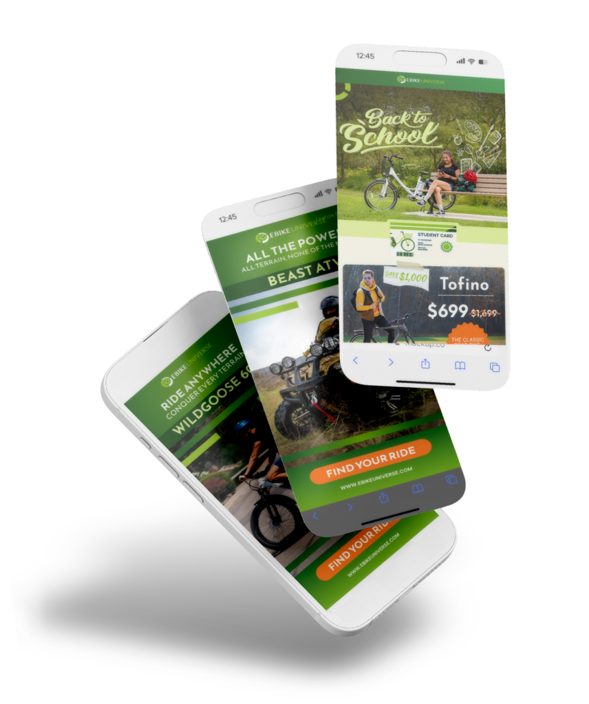
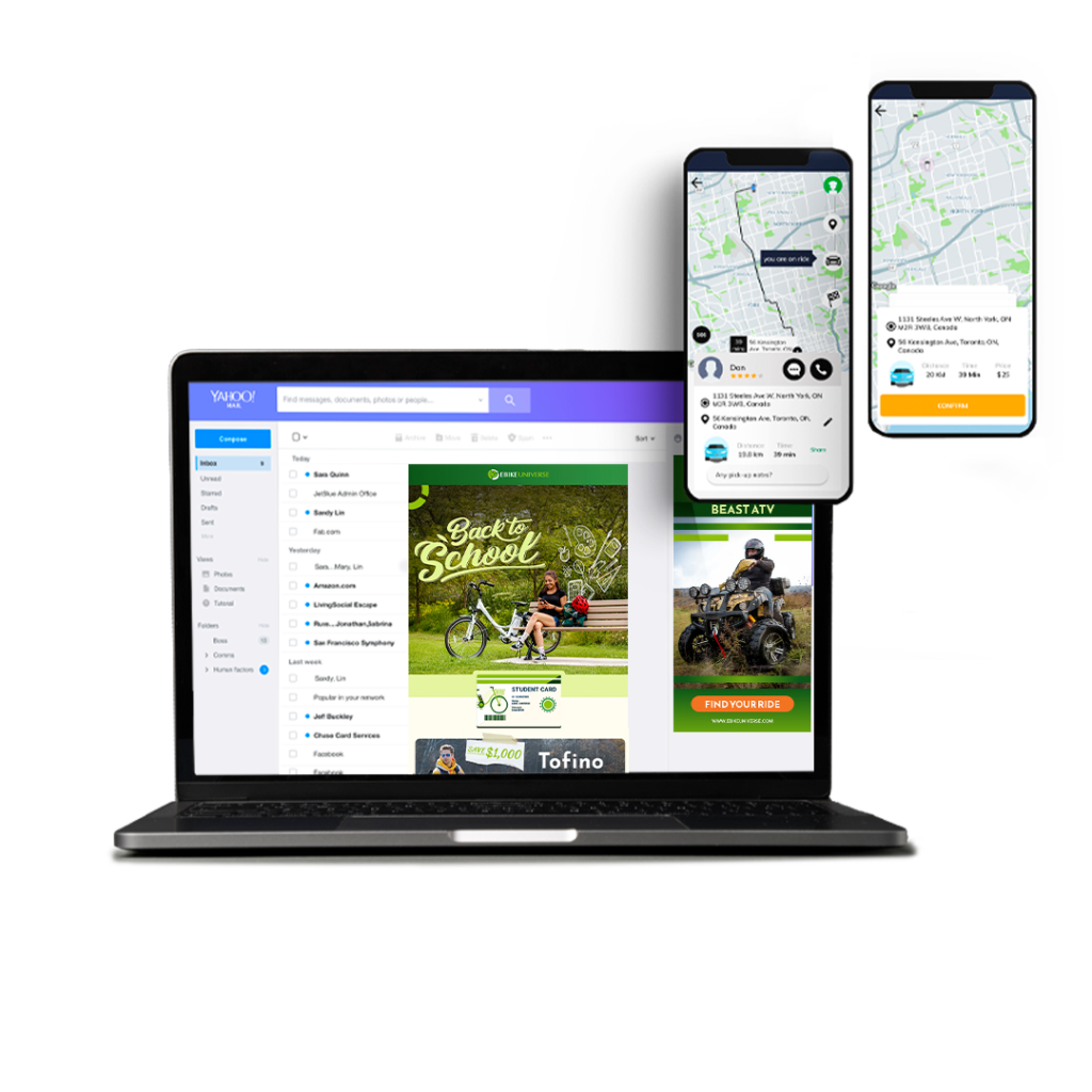
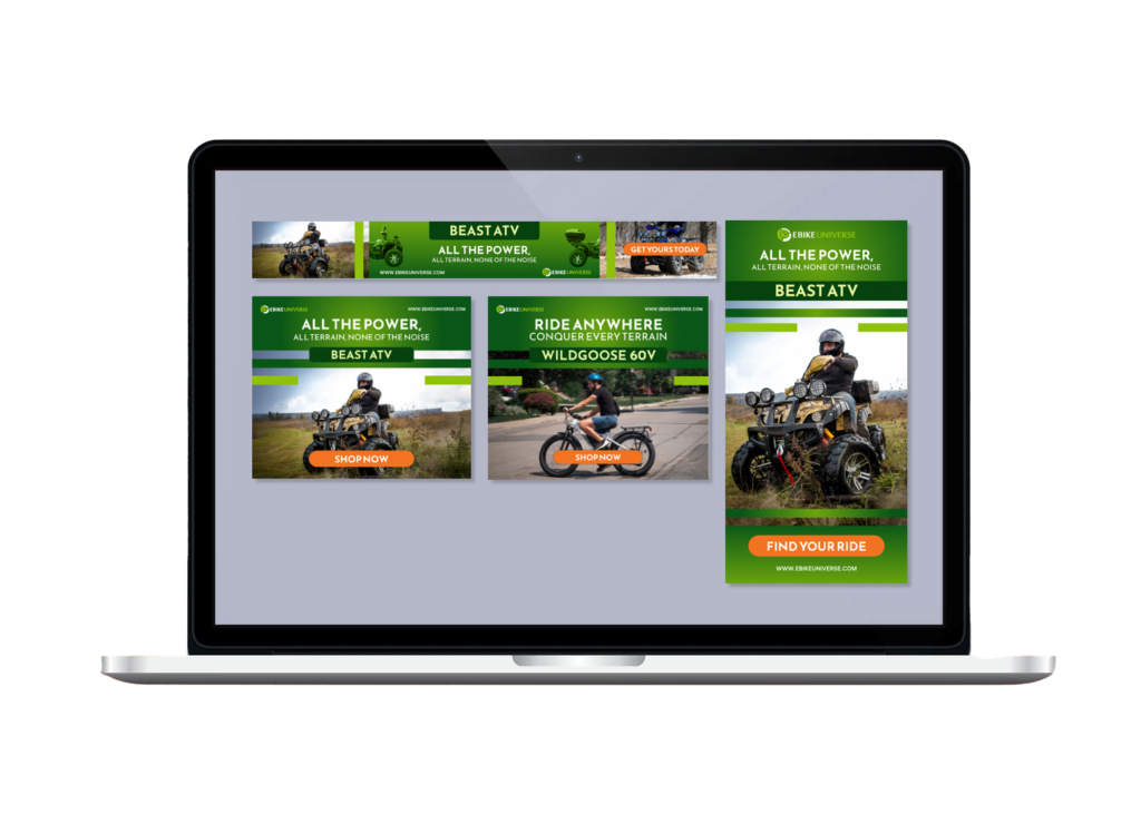
At Daymak, I was tasked with creating a Google Display Ad campaign for 2 of the company’s all terrain electric vehicles: The Beast ATV and the Wildgoose Ebike. I went about this project by developing unque taglines for both products, which can be seen in the ads. Adhering to the retail companies Brand colours of green and orange, the final design uses the bright orange for the call to action on the ads while keeping the green in the background to impart a sense of eco-friendliness. All these ads were created in different sizes to in order to maximize impressions online.
Logo & Brand Design
Welcome to my Logo & Brand Design portfolio page, Featured here are select works that showcase my brand building capability.
Each project is accompanied by a detailed account of my design process, from conception to execution. Explore the projects below to discover how thoughtful design can not only overcome challenges but also create impactful, memorable brand identities.
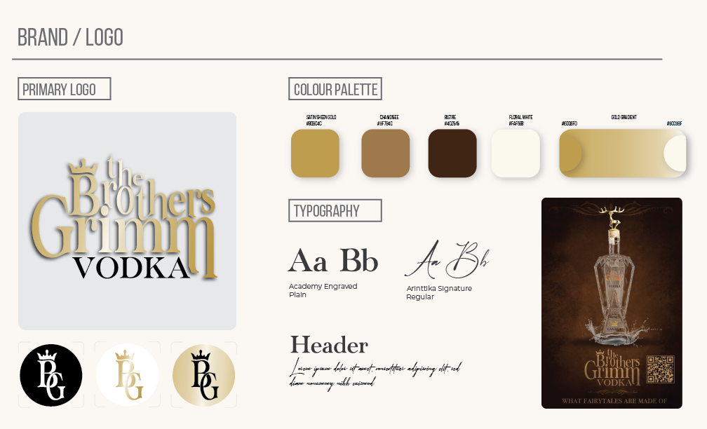
I was approached by my clients to design the logo and branding for the vodka company “The Brothers Grimm”. Designing a label for “The Brothers Grimm Vodka” was a captivating and imaginative process that aimed to capture the essence of mystery and enchantment associated with the famous literary duo.
My objective was to create a label that seamlessly blended folklore with a modern and sophisticated aesthetic, I employed a combination of traditional and digital design techniques to achieve this result.
Creating the bottle design for The Brothers Grimm involved mutiple challenges:
- Differentiation: The primary challenge was ensuring the vodka bottle stood out in a crowded market.
- Design Concept: Deciding on a unique feature that would capture consumer attention while staying true to the brand.
- Aesthetic Balance: Maintaining a sophisticated design balance between the bottle and the gold figurine toppers to ensure appeal.
Once the brand was developed and the logo was created, I was able to brainstorm with the founders of the company to come up with the bottle design and implement a unique figurine to help differentiate the product in a crowded market. The Brothers Grimm Vodka now has a tequila line launchine, using the same bottle, with a cobra head as the figurine topper.
- Crown Motif: Symbolizes nobility, aligning with the mystical themes of Grimm fairy tales, adds a sense of fantasy.
- Gold Color Scheme: Elevates luxury, mirrors treasure from fairy tales, creates a visual connection to enchantment and wealth.
- Serif Fonts: Enhances elegance and tradition, contrasts with modern design elements for a balanced, timeless appeal.
Outcome: The combination of the crown, gold palette, and serif fonts merges fairy tale with modern luxury striking a balance between tradition and innovation. This bottle can be found at the LCBO.
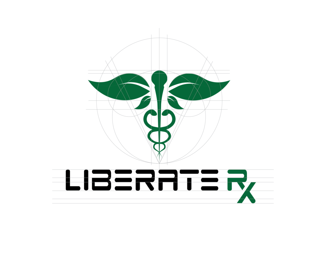
The project assignment involved designing a logo for Liberate Rx, a pharmaceutical company with a unique mission of combining modern and holistic medicine. The task was to create a logo and branding guidelines that effectively emphasized this combination.
I decided the best approach was creatively integrating the traditional medical symbol, the Caduceus, with natural elements, specifically by replacing the traditional wings with leaves. This design aimed to visually represent the company’s innovative approach to healthcare, merging the credibility of modern medicine with the natural benefits of holistic practices.
Creating the logo for Liberate Rx presented several challenges:
Balancing Symbolism: Integrating the traditional Caduceus symbol with leaves to represent both modern and holistic medicine required careful consideration to ensure both elements were harmoniously balanced and easily recognizable.
Maintaining Clarity: Replacing the wings of the Caduceus with leaves posed the challenge of maintaining the symbol’s clarity and recognizability, ensuring it was still identifiable as a medical symbol while clearly conveying the holistic aspect.
Addressing these challenges required iterative design processes, experimenting with various configurations, and testing the logo in different contexts to ensure it met the intended vision and functioned effectively across all applications.
- Inspiration & Modification: Traditional Caduceus symbol, representing medicine. Replacing wings with leaves to highlight natural, holistic healing.
- Symbolism: Leaves signify vitality and renewal, emphasizing Liberate Rx’s holistic approach.
- Color Palette: Green hues for natural aspects, complemented by blue for trustworthiness in modern medicine.
Outcome: A distinctive logo that merges traditional and holistic medicine, reflecting Liberate Rx’s innovative healthcare solutions.

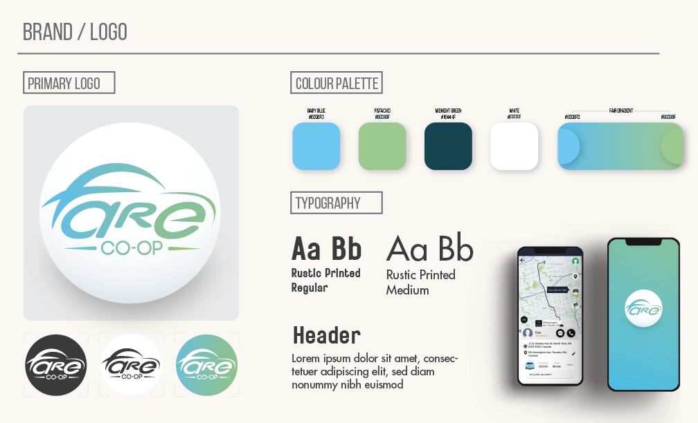
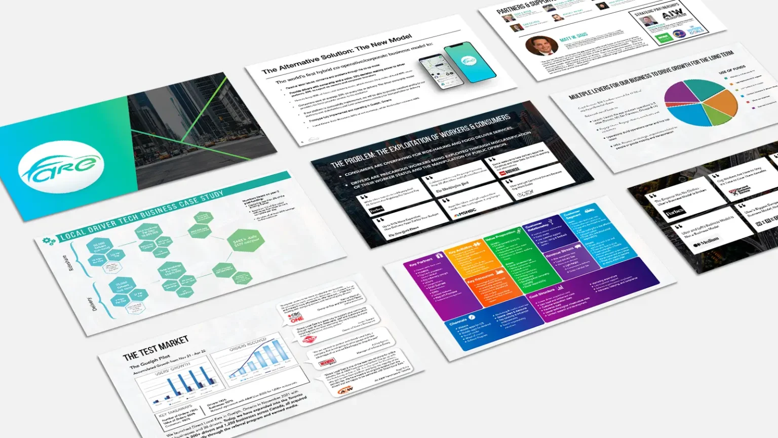
Collaborating with Fare provided an exceptional opportunity to contribute to a start-up’s foundational branding and digital presence. I was entrusted with the development of the company’s logo, branding guidelines, website, mobile application, and a presentation deck designed for venture capitalists. Fare distinguishes itself in the rideshare industry through a corporate/cooperative model, granting drivers equity within their respective districts. This innovative approach not only enhances earnings for drivers but also offers a cost-effective solution for riders.
This was a professionally enriching experience, underscored by the company’s commitment to redefining industry standards and fostering equitable growth.
The challenge for this project was integrating the word fare into the logo as requested by the clients:
- Maintaining Readability: Ensuring that “fare” remained legible and easily recognizable within the confines of a car silhouette was a primary concern.
- Design Balance: Achieving a harmonious balance between the typography of “fare” and the car’s profile shape required meticulous adjustment of font size, style, and positioning.
- Innovation vs. Clarity: Striking the right balance between being innovative with the design while ensuring clarity and immediate recognition of the concept posed an ongoing challenge throughout the design process.
- Typography Integration: Chose a sleek, modern font for “fare” that seamlessly melds into the car’s profile, ensuring readability and brand alignment.
- Car Silhouette: Opted for a minimalist car outline that provided enough structure for the word “fare” to be clearly integrated, maintaining simplicity and recognizability.
Outcome: The final design is a distinctive, cohesive logo that encapsulates Fare’s innovative rideshare model, ensuring brand identity is effectively communicated while maintaining functional versatility across various media.
Print & Information Design
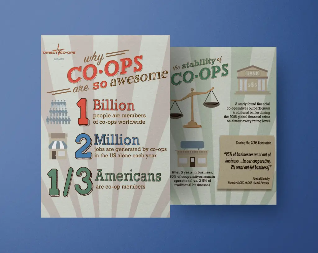
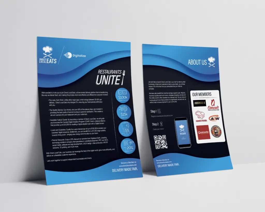
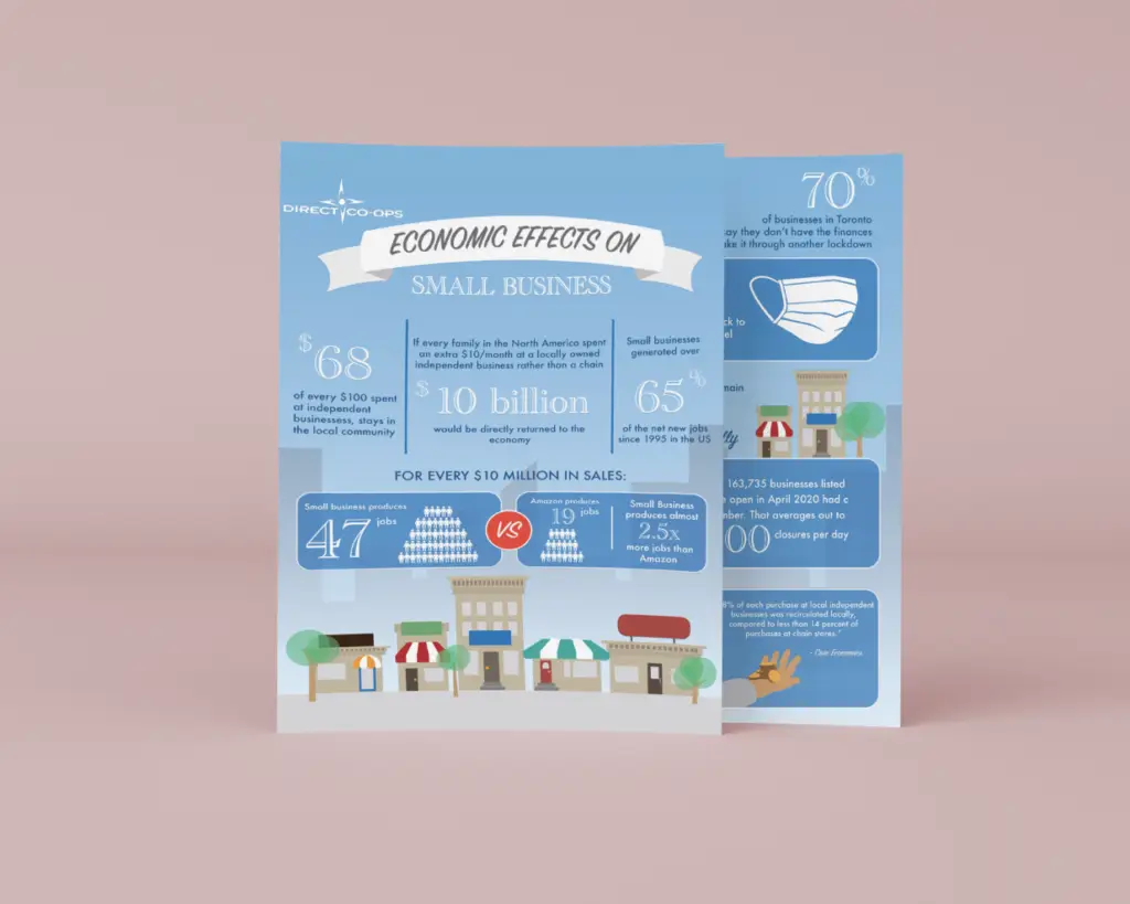
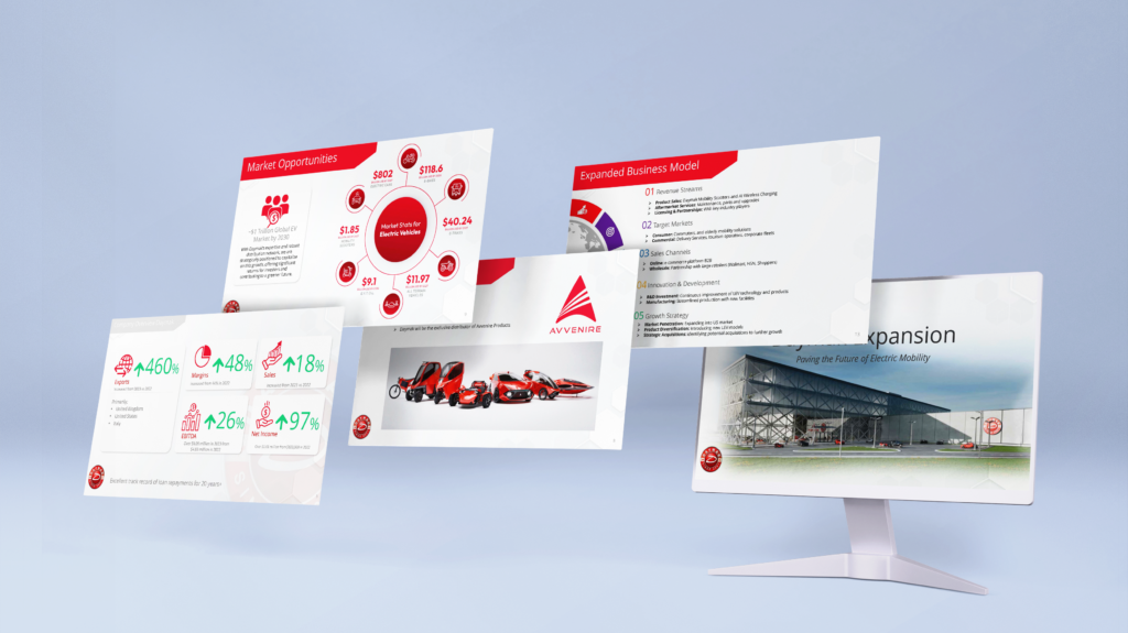
Below, you will discover a curated selection of my work in print and information design, accumulated over several years. This collection encompasses a diverse array of projects, including sophisticated infographics, engaging flyers, compelling posters, and distinctive logos, each crafted with a keen eye for detail and a commitment to visual excellence.
Infographics & Decks
Product Design
Product design can be distinguished between the physical design of products and packaging to the digital interface of more intagible products like websites or apps. Over the course of my professional career, I have experience creating both digital and physical designs.
During the pandemic, I designed sanitizer bottles, and PPE mask boxes. As a freelance designer, I had the pleasure of working with a start-up called Cocktail Companions, where I designed Trade booths, logos, and box designs for their product. On top of this, working with The Brothers Grimm involved working with the team and manufacturer to design the logo and bottle design. This project required immense attention to detail, schematics, precise communication and execution. Both of these projects encompassed crafting and creating a brand identity for a company from top to bottom – including logo and brand design, colour palettes, print and promotional materials and packaging designs.
Finally, my experience working with Fare and Direct Local Eats was catered toward UI Design. I worked with programmers to design prototypes of the app interfaces for both products to craft an easy to use and easily navigatable system based on best practices and developed brand guidelines.

